Filtered product listings are easily the best way to help a customer find what they want. However, a customer might not know exactly what they’re looking for or filter options might not have all the choices to help narrow a list down to just a few items.
Long listing pages are a necessity that help show what your online store has to offer.
Apart from filtering a long list down to a manageable size, online stores use either paging, or a “load more” option to quickly show users one quick loading block of items at a time. Each has their benefits, yet neither solution is perfect.
Paging
If your listing has more items than you’d like to show on a single page load, showing clickable page numbers helps the user navigate through your product list.
Benefits
- Quickly load a subset of items user can easily scroll through
- User may recall an item they’d like to see again and can use a page number to easily jump back to that item
- Indicates to the user the length of items in your list
- With quick links to first and last page, user can easily manage navigating a long list of pages
Paging isn’t perfect, however. Some lists might end up being more pages than would fit in a single list requiring something like this:

Drawbacks
- Usually requires a page refresh going from one page to another
- Position isn’t usually saved when leaving the list and coming back, so you’re often starting back at the beginning
- Long paging numbers list can be cumbersome
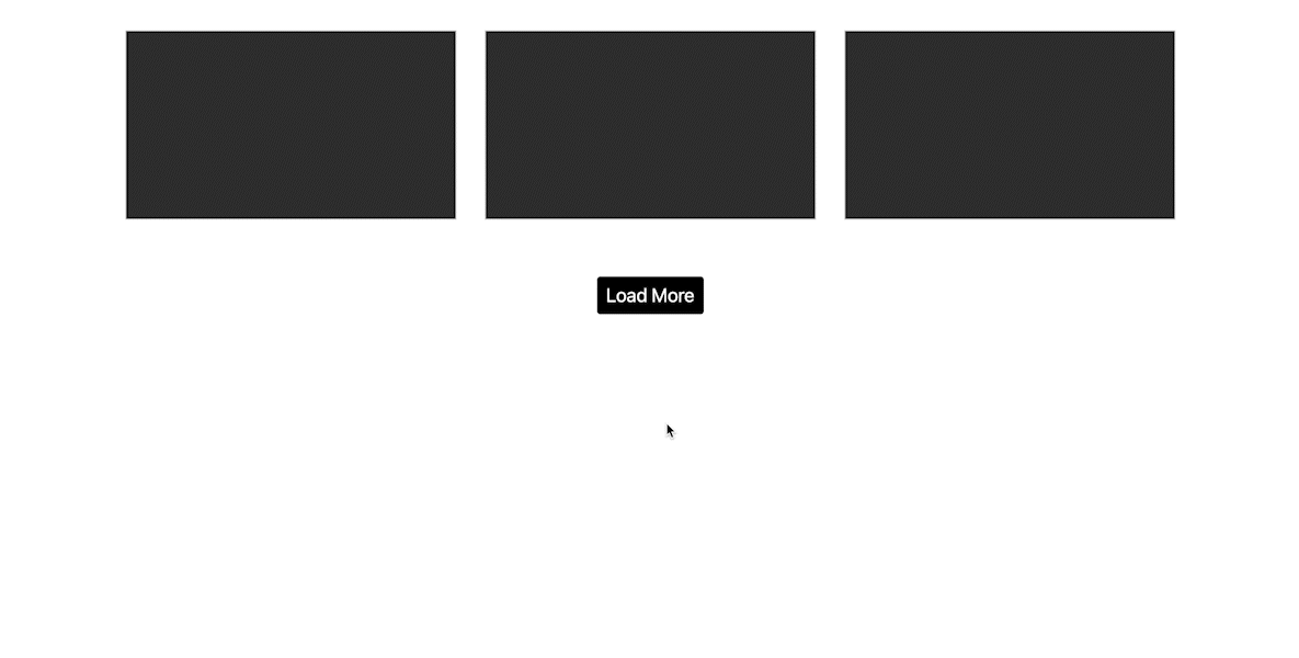
Load More
Though paging has been around for decades, a more recent trend is to show the next page of items behind a load more button or scroll action putting all items on one page, increasing the page length as the user scrolls or clicks to load more. This makes it easier for the user to get to the next page in some cases without requiring a click. Though handy for a few pages, it does create some potential issues as well.
Benefits
- User can easily keep scrolling through the end of the list
- Depending on implementation, everything can simply load on scroll
- User can easily get back to the first set of items simply by scrolling up
From a user’s perspective, load more solves some problems, yet introduces others that paging handles better.
Drawbacks
- When coming back to the listing page, user will most likely need to load more to get back to the view they were on before
- After multiple load more clicks, page can become slow or unresponsive with limited hardware resources
- Can’t easily jump to the end of the list
- Loading each new set might feel slower than a simple page refresh
Simple Next/Previous
A simpler option is to show a single button for next and previous page, or Older/Newer for time related articles. This simplifies the options assuming a user wants to click through everything available. This could be simplified further with just a next link assuming a visitor would use the browser back button.

This option doesn’t give the user an easy way to go back to a certain point, however. Depending on your content and user flow, that might not be an issue.
Best Practices
- Highlight Current Page:
The current page number should be visually distinct (e.g., bold or highlighted). - Responsive Design:
Ensure the paging works well on mobile devices. You might show fewer page numbers or even a dropdown for page selection. - Accessibility:
Include ARIA labels for screen readers to announce page changes. - Fast Navigation:
If there are many pages, consider adding a dropdown or input field for users to jump to a specific page directly.
Conclusion
As with anything online there are many ways to create intuitive navigation in a design. Sometimes doing something familiar that visitors are used to is the ideal solution, though that shouldn’t limit designing something new and inventive. Hopefully, designs will consider the user when creating navigation UI to make sure it’s something that looks and works well for everyone.
Share: